Friday, 19 August 2011

Baltic Trip

I'm sometimes reluctant to visit The Baltic because they rarely have more than one exhibition on when I go. But this time I was pleasantly surprised; four floors full and open to view.
We decided to work from the top floor downwards so we took the stairs up to level 5 ( thigh workout!). It was a clammy day outside and I was tempted to have a lie down halfway up the stairs, partly because my legs hurt and partly because the I knew the metal floor would feel icy cool, but don't worry..I resisted :)

The top floors were occupied by Robert Breer's work. The majority of the floor space was filled with his 'floats' which are objects of different sizes and materials, moving around the room at an incredibly slow pace. And by 'incredibly slow' I mean its almost undetectable, I was in the room for fifteen minutes before I realized even one of them was mobile. I'm sure if you sat there a while you'd notice them changing position over time. Other than that Breer made films from his paintings, collating them like a flip book flickering before your eyes. It was hard to stand and watch for any length of time before it hurt my eyes, so I think I'm a bigger fan of his floats.

Float, Rug#5 and Beam, Images by angelfloresjr.multiply.com where there is also an interview with Breer
The middle exhibition was from Maurizio Anzeri, it was my favorite of the three on show. He uses found photographs and embroiders into them to create strange masks and coverings on the faces of the photos subjects. I read something while I was wandering around the exhibition which said Anzeri studied the importance of African masks within tribal cultures; this could indicate why he focuses on the face when embroidering. I'm attracted to the vibrant colours and the idea of reinventing found objects, also work with fine detail interests me as I know time has been invested into the piece.

One other thing... it brings back memories of doing Spirograph pictures with my sisters.
Maurizio Anzeri, Image from The Baltic

I found Mariah Robertson's exhibition was interesting because of how it was displayed. She uses photo development techniques in a dark room, combined with chemical 'paints' to produce colourful expanses of artwork. Looking closely you can make out ghostly images of the original photos, but I preferred standing back ad admiring the whole effect. Robertson's work is presented more like objects which was an approach to photography I haven't seen before therefore it was refreshing.

Courtesy Museum 52, New York. © the artist.
Mariah Robertson, Image from The Baltic


Baltic Trip

Thursday, 18 August 2011

You may find this boring.. but my mind boggles!

My last post was about fashion created with a 3D printing technique. At first I couldn't quite get my head around how it worked.... Is the design printed onto the garment when it is assembled as opposed to being flat pieces? Is it printed to simply appear like a sculpture and really its just flat? I didn't know! 
That was until my mam told me about something she was watching on TV, where a model was created on a computer program with all necessary dimensions etc. This information was then fed to an inkjet laser printing system which built the model using fine layers of resin. I'm not gonna pretend to understand the workings of this process but I'm guessing this is how the gorgeous crystal inspired garments were made. 
Apparently this technique has been around for 20 years, yet it seems completely space age to me!

Oh, and a quick Google search has answered my earlier questions; printing a 2D image onto a 3D surface is called Pad printing, and Lenticular printing is when a 2D image is printed to appear 3D.
Hmm..think I get it. 


Saturday, 30 July 2011

Fashion + architecture = amazing

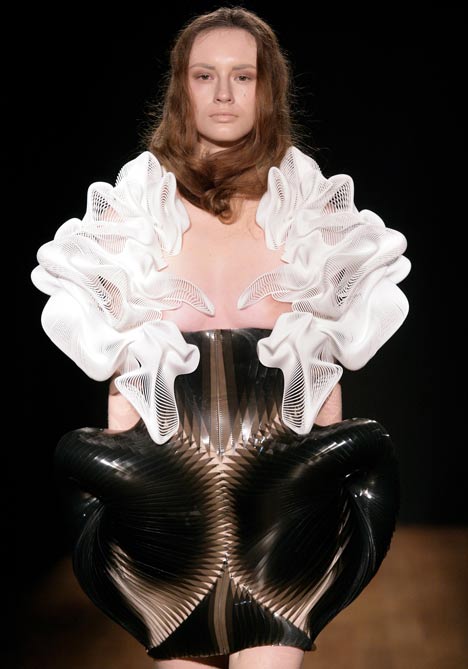
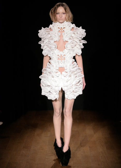
Escapism by Daniel Widrig and Iris van Herpen

Escapism by Daniel Widrig and Iris van Herpen

Gorgeous! They're more like sculptures not outfits but I don't think practicality was a major factor in designing this collection anyway..

Crystallization was a collection created by designer Iris van Herpen in 2010, inspired by the way in which liquids form crystals when solidifying. He returned to the project this year with the help of London architect Daniel Widrig. The collection that followed was called Escapism (images above).

There is some sort of 3D digital printing process involved in the production of these garments, so I'll be doing some more research to find out more about it.....Right now all I know is that I'm fascinated.

Read and see more here.
Images from Dezeen.com

Lovely prints..


I've just been looking on the Basso and Brooke site and browsing their collections. It's a fairly new name to me so I thought a little research was in order.. As it turns out I'm now in love with their digital prints! 


This one (Cosmic Dust s/s 2011)  might be my favorite but there are so many its hard to choose. I'd love experiment with prints in my work at some point as I think it would work well with my structured designs. I have been looking at Mary Katrantzou's work a lot recently, she is another designer who uses print extensively while combining it with strong silhouettes and structure.

Image from Basso and Brooke
....also check out Mary Katrantzou and her lampshade skirts!

Saturday, 30 April 2011

Alexander Millar- Working Man at the Hancock


This exhibition is on at The Hancock Museum at the moment, it follows a character simply called 'gadgie' at various places in and around Newcastle during the peak of the mining and shipping industry. I found it interesting because its different to a lot of the art I've seen lately. The figures are cartoon like and you never see any faces, perhaps this is to allow the characters to represent anybody living in the northeast in the 60's.

Wednesday, 27 April 2011

Sunday, 24 April 2011

Trip to York turns cultural!

On a recent visit to York I stopped off at the Art Gallery to see if anything caught my eye. This gallery visit, more than any other, made me see how much my background in fine art at A-level has influenced my taste in art. I was more drawn to little Henry Moore inspired figures and a hologram portrait of Queen Elizabeth than the still life paintings of fruit and skulls.
I also came across two pieces by John Stezaker which were intriguing. He used 50’s stars photos, cleverly masked with a postcard. The photo on the postcard takes on the features of the face beneath because of its placement. The image below was one of the pieces on show at the museum; you can see that the tunnel and shrubs become the woman’s eyes.

Monday, 11 April 2011

Half way meeting

Branding seems to be on my mind every minute of the day. Logos are everywhere when you think about it, from the second you wake up you're bombarded with branding without even being aware. Its on make-up, hair products, bottles of water, phones, buses, chocolate bars...everything!

We had a meeting with Colin today to see how we're getting on with the project. He likes our company name Re-Find and thinks we should put more emphasis on it as its the strongest part of our work. We also need to push the idea of eco-friendly fashion further and stay away from the obvious. I'm sure Vogue did a piece on Make Do and Mend a while ago, with a dress made out of yellow rubber gloves amongst other things....must find it for college tomorrow....


Monday, 4 April 2011

First Crit

This morning started with a crit of what we had gathered and produced over the week. We did some peer assessment first which was very helpful as we got to look at another group who had obviously worked hard on their research. Their mission statement was flawless and there was such a wide range of research from historical art to shop handouts.
We quickly realized our own work paled in comparison so I had a lot to write down when we regrouped to talk about each other’s work.
Notes from the crit:
Mission statement- is very clear just need to identify a style for the brand and each of the collections.
Shop report- needs drawings and more depth such as key features of the shops
Branding- should be more fashion like, perhaps change the name and drop the obvious links to recycling such as the arrows.
Perhaps make the logo different for each audience and also look into recycling and eco fashion more.
After this we discussed in the group how we could improve our work. We decided to look back at the original ideas of the brand and came to the conclusion that we had put too much emphasis on the eco-friendly side of it. We need to make it clear that we are making fashionable trend driven clothes, which isn’t what people expect from environmentally friendly garments. We also don’t want the brand identity to limit us when it comes to designs.
So the logo will be revamped but the name will remain the same. We decided on festivals as a theme for the collections, which also defines our customer profile quite easily.
Today we did a lot of discussing as a group which meant we were all chipping in and analyzing each other’s ideas. We coped well with this and I was pleased at how we all listened and compromised with other members of the group. The work load is being shared equally so far and the enthusiasm for the project is still there which I find encouraging. 

Tuesday, 29 March 2011

Team work

We had to write a mission statement today which led to the naming of our brand Re-Find. We’ve decided to centre it on fashionable eco-friendly clothing and incorporate recycling into our packaging.
I think we worked really well and produced a strong piece of writing which conveyed our intentions clearly and effectively. No criticism during a mid-day crit.
We’ve now decided on areas of design for the team members:
Womenswear-
    Casual- Carmel
    Outerwear- Heather
Menswear-
 Katie
Children’s wear-
    Girls- Jade
    Boys- Christie
Lingerie-
Eleanor
Because of the new idea of eco-friendly fashion we’re now looking for similar companies in the fashion industry. This will be work for the week ahead, along with some branding ideas.

Monday, 28 March 2011

Branding project

Today we were put into our groups for the branding project. In my group are; Carmel, Christie, Eleanor, Jade and Katie.
At first we looked at each other’s branding research and discussed how branding is used differently at the separate market levels. Low end brands such as those on the high-street do not brand in an obvious way. We talked about how customers wouldn’t want to wear something with a cheaper brand printed on it; therefore these garments carry the company name on hidden tags. Some company’s like Next and Gucci are lifestyle brands who produce everything from clothing and interior furnishings down to towels and dog accessories.
High end labels can brand in discreet ways, for instance the Ralph Lauren logo, and also more obvious ways such as the Louis Vuitton print. 
We had a talk on branding from Colin Reid which I found really interesting and made plenty of notes from.
For tomorrow we need to have looked at some stores from our chosen market level. My group decided on the lower end of mid-range so I’ll be looking at Karen Millen and French Connection today.

Friday, 25 March 2011

Getting the hang of this CAAD thing...

After a little problem I had with layers (everything was on one layer!) I realized it was quicker to start from scratch and do my flats again. It was surprisingly quick after I'd had all of this practice doing the first lot. So here are some screen shots of where I am at the moment, adding colour and fabric swatches that I scanned in.


I traced the flats from original scanned drawings, tracing in a colour other than black makes it easier to see which bits I've already done.


With so many layers its good practice to lock ones you're not working with to save anything altering on a layer you aren't using.

Wednesday, 23 March 2011

Uh oh ...Module Evaluation

Even though bits like this seem a chore they really do help once they're done as it makes you ask yourself questions and it becomes it clear how to improve next time. I find writing essays and things like this quite difficult at times because I struggle to put my jumble of thoughts into words, but here goes.. my module evaluation:

My initial inspiration for this module was Victorian menswear. I chose this because when reading up on the subject, I found I liked some elements of menswear at that time yet wanted to create a women’s shirt. I thought it would be an interesting twist that perhaps others in the class wouldn’t be doing. I feel my design development was neat and well set out; I added more annotation than previous projects as this is an area where I sometimes need to improve on. I definitely need to work on adding colour to my designs to communicate my ideas more.
I enjoyed the makeup part of the project as I am confident with pattern cutting and am improving my sewing skills. I needed to make two toiles as the first one made with a shirt block was not fitted enough and the sleeves were too loose.  I think the most successful part of my project was the final garment as the visitor from Phase clothing company said it was a possible runner up in the final viewing. I was told the fabric and colour choices worked nicely together, I had an appropriate amount of detail and overall the shirt was well made.
I think the weakest part of this module was my portfolio work i.e. moodboards, in contrast to this being the strongest part of my last project. I found it difficult as my fabrics were changed during garment manufacture, so what I originally wanted to be pinstripe was a floral patterned fabric in the end. My colour pallet altered as a result of this also so all of my boards needed to be redone later on in the project.
I liked having a live brief and contact with a professional at the end of the project, it was a good experience to have a different person’s opinion on my work and it also gave me some encouragement to work harder in the coming projects.

Tuesday, 22 March 2011

Final presentation

Yesterday was the deadline for my steampunk project. Two representatives from Phase clothing came along to see the finished garments and give feedback on how well we had answered the brief. 
Once we had set up the room with all of the mannequins it looked really impressive, you could tell the whole class had worked really hard. It was nice to see and appreciate each other's work as I had been so focused on my own garment I hadn't seen many other shirts being made up.

The feedback I received was mainly positive, it was mentioned that I could have made a singular collar as opposed to the double one on my garment. This could have been worn up and starched open at top like in the image below.
Other than that I was told the fabric and colour choices worked nicely together, I had an appropriate amount of detail and that the shirt was well made. All in all it was a good experience to have a different persons opinion on my work and it also gave me some encouragement to work harder in the coming projects.

Image from premierclothing.com

Monday, 14 March 2011

How CAAD is coming along..

I haven't ever been one for computers especially when doing art work and designs but I'm really getting the hang of Illustrator! We've been having weekly sessions on Adobe Illustrator and its part of one of our current modules so I'm trying my best and apparently its paying off. According to my teacher Gemma, my flats are looking accurate and professional so she was pleased when she checked how I was doing. 

  
Two designs, four flats... probably more than four hours work but remember I'm still getting the hang of this!


Next I'll be adding the fabric swatches and buttons etc.

Sunday, 13 March 2011

New Purchase....

I've had a slight lack of motivation since Christmas so I decided to treat myself to a gorgeous mannequin. It took two days to come but it was worth the wait, I love it and it has definitely given me a boost with my work!

Its beautiful just stood on its own but I wanted to experiment a bit so I grabbed some fabric I had lying around and began pinning. I'm a perfectionist with my work and I like to plan things carefully so it was difficult just making something up on the spot. When I have time I'd like to try something like this and make a pattern from it as opposed to pattern cutting straight from the beginning of garment production.  


Nearly Done

The Steampunk shirt is nearly finished, just the buttons to go on! Here's how its looking so far....


I had a slight problem when inserting the piping on the sleeves as I attached it to the gathered organza first when it would have been easier to sew it to the more stable, cotton part of the sleeve. Other than that blip everything has went smoothly since the toile stage. Should finish it off tomorrow....

Thursday, 3 March 2011

More photos

Starting in my proper fabrics....hope I don't make any mistakes!


Much Better!

The toile from a different dress block has worked! Much better fit on the body, I slimmed down the sleeve too so the volume at the sleeve head is more pronounced. Only minor changes need to be made such as scooping out the neck a little to make the collar sit nicely and correcting some stitch lines for the final garment.

The first attempt....


And now...much better!


Monday, 14 February 2011

Make up!

Production of my steampunk shirt began a few weeks ago. I started off using a slim-fit shirt block from which I made the first toile. My final design is more fitted to the body so I've recently started from scratch with a dress block, hopefully this will be a more suitable fit.

When we were given the brief a few points were made about how Victorian women layered their garments. As the shirt would be worn under several other layers I think its worth the effort to make it fitted so that the customer is comfortable when wearing it with other pieces.

Saturday, 15 January 2011

Loving these!

McQ Pre-Fall/Winter 2011 videos. 

I've just watched these on the McQueenWorld channel on Youtube and they're great! Sooo unique and very British. A little insight into the lives of four young girls, all giving their opinions or views on fears, dreams and love. Its amazing how their quirky personalities are captured. For me the short clips have a fine art feel to them; they're honest and bold. 
Is it just me or does McQueen get more impressive as the seasons roll on?

Flash back

Last year, on my Foundation Diploma, I did a project based on the female dandy trend that was around at that time. My final garment was a plaid waistcoat made from a pair of cropped trousers and a peach jersey dress. I also made a ruffled neck piece to convey the trend more.
Its similar to the steampunk theme in a way, its old fashioned with a modern twist. Inspiration for my steampunk project came from victorian menswear so a glance back at this shoot might be useful for me. Here are some photos of the look......


Thursday, 13 January 2011

Steampunk begins

How would I describe steampunk fashion?  Hmm..... a mixture of corsetry, lace and ruffles, given a harder edge with buckles, chains and studs. Think sci-fi meets the Victorian era, in this fictional world the future has arrived early.
This new project has a live brief, given to us by Phase, a local alternative clothing company. For the project I am required to design and produce a shirt or shirt dress based on the steampunk theme.


I've tried to keep my designs modern while staying focused on the original theme much like garments in the image above. I looked at menswear in the Victorian era and used this as inspiration, emphasising collars and sectioning the sleeves to mimic arm garters. 

When researching steampunk fashion I found these websites usefull:

Improvements

This week I received feedback from a previous college project. One of the areas I need to work on is my illustration skills, so I've gotten myself a sketchbook that I intend to fill with various drawings and illustrations in the coming months. Hopefully this will build my confidence with illustrations and perhaps allow me to develop a personal style I can stick with for future projects.

To start with I'm going to draw from magazines and photos, below are the first two I've done this week. Lots of room for improvement but this is just the beginning...  More to come!


Tuesday, 11 January 2011

Thursday, 6 January 2011

BBC Blast Your Label Competition


The brief for this competition was to design a capsule collection inspired by one of three collections at the V&A museum. I chose to look at ceramics and above are the three designs I submitted. My final collection consisted of six outfits which were shown at an event during London Fashion Week September 2010.


My collection explores 1970’s artwork with a modern twist. Glenys Barton’s piece, Twelve Cubes, in the ceramics collection at the V&A Museum caught my attention immediately. I like the simplicity of the piece, its clean lines and striking use of colour. This is where I found my inspiration for a print, the colours remaining the same yet with grey/blue tones to replicate the colour of Barton’s clay.
I came across another work of Barton’s, Figure Group- Monte Alban II, a powerful piece showing two human figures, each at the top of a slender flight of steps. To incorporate this into my designs I used sections of pleats to echo the line of the stairs. I also created a strong solid shoulder that refers to the motionless properties of clay, in contrast to the movement in some other parts of my garments.
Photos of the event can be found here.